

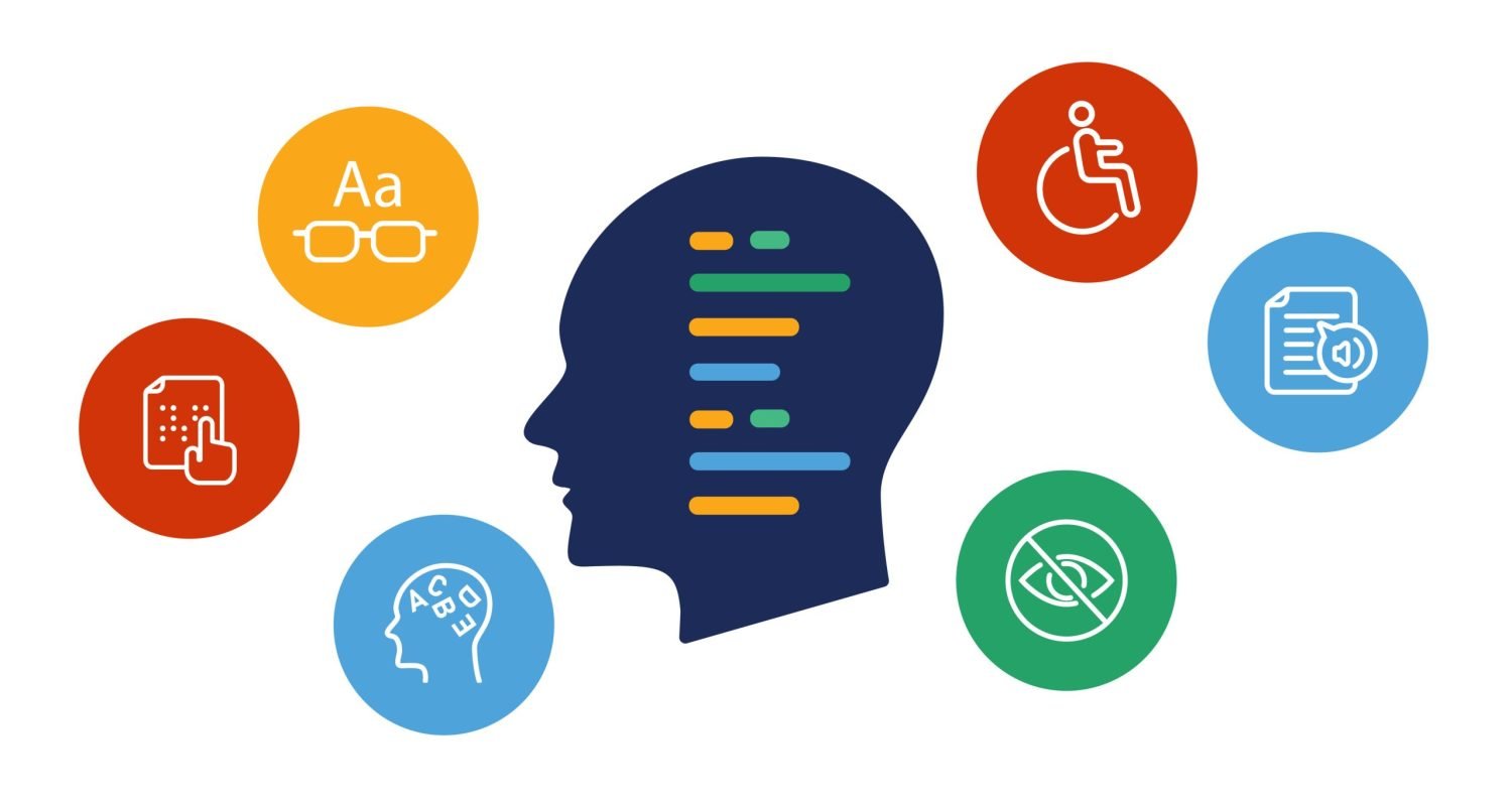
Website Accessibility Checklist for Content Creators
About 1 in 4 adults has a disability that affects how they use websites. That’s millions of potential customers, readers, or community members who might hit a wall trying to use your site. But here’s the thing—most accessibility fixes are easier than you think, and they make your website better for everyone.
When someone can’t distinguish between your text and background colors, or when a screen reader can’t make sense of your headings, you’re not just missing out on reaching them. You’re creating frustration where there should be connection. Let’s fix that and avoid irritating site indexing, assistive readers, and possibly a lawsuit!
The Accessibility Basics You Need to Get Right to be ADA Compliant
1. Fix Your Heading Structure
Your headings are like a roadmap for people using screen readers. Think of them as the chapter headings in a book—they need to make sense in order.
- Use one H1 per page (that’s your main title)
- Follow the order: H1, then H2, then H3—don’t skip around; but you can go back up H1, H2, H3, H2, H3, H4, H3, etc.
- Write headings that actually tell people what’s coming next. This signals search that what is coming is worthy of being noticed. If it doesn’t have keywords and phrases, just make it big type, not an H1, H2, H3 type of header.
- Don’t pick a heading level just because you like how it looks
Most screen reader users navigate websites by jumping from heading to heading. If your structure is all over the place, you’re making their job much harder.
2. Get Your Color Contrast Right
Not everyone sees colors the way you do. Some people have low vision, others are colorblind, and many of us are just trying to read on our phones in bright sunlight. High contrast is HUGE. Even your buttons need to have high contrast on hover, too.
Here’s what you need to know:
- Normal text needs a 4.5:1 contrast ratio against its background
- Large text (18pt or bigger, or 14pt bold) needs 3:1 contrast
- This applies to text over images too—be extra careful there
- Don’t rely only on color to show important information
The good news? There are free tools to check this stuff for you. I use this one all the time for logo development, too.
3. Write Better Alt Text for Images
Alt text is what screen readers “say” when they encounter an image. It’s also what shows up when images don’t load.
Here’s how to write good alt text:
- Describe what’s important about the image, not just what you see
- Keep it under 125 characters when possible
- Don’t start with “Image of” or “Photo of”—screen readers already know it’s an image
- For decorative images that don’t add information, use empty alt text (alt=””) – and for title, description, and caption. Be consistent.
- For buttons or links that are images, describe what happens when you click.
Examples:
- Bad: “Image of dog”
- Better: “Golden retriever running through autumn leaves”
- For a download button: “Download 2025 annual report” (not “red download arrow”)
<!– GOOD – Truly decorative –>
<img src=”decorative-border.jpg” alt=””><!– BAD – Will still trigger some accessibility tools –>
<img src=”decorative-border.jpg” alt=”” title=”Decorative border” description=”Pretty border image”>
4. Make Your Links Make Sense
Nobody wants to click on a link that says “click here” when they have no idea where “here” is.
- Write descriptive link text that tells people where they’re going
- Avoid “click here,” “read more,” or “learn more”
- Make sure links look different from regular text (underlines work great)
- Speaking of underlining – only use underlining when it is a link. Underlinaing is a signal to those with assistance devices that there is a link in that text. For emphasis, try bold, italics, or making it larger or another high-contrast color.
- Ensure everything works with just a keyboard
Instead of: “For more information about our services, click here” Try: “Read our complete guide to web accessibility services”
5. Label Your Forms Properly
Forms can be frustrating for everyone, but they’re especially tricky for people using assistive technology.
- Every form field needs a clear label. It doesn’t look as tidy, but is it easier for everyone to navigate.
- Tell people what format you want (like “MM/DD/YYYY” for dates). Nothing worse than having to GUESS what format is required.
- Mark required fields clearly—don’t just use an asterisk. This may be a challenge. You may have to add (required) to the label to be very clear.
- When something goes wrong, explain what needs to be fixed and how.
6. Other Important Stuff
- Add captions to your videos. Not everyone wants to hear your lovely voice, but they will want to learn what you are showing.
- Test your site with just your keyboard (Tab through everything)
- Use real HTML elements instead of fake ones made with divs and CSS
- Keep your content organized with proper lists and paragraphs
- Test with a screen reader if you can
Tools That Actually Help
Some are free, while others are one-time add-ons you’ll need for a while. You can always cancel and switch to a month-to-month plan, not an annual one!
Free Tools You Can Use Right Now:
- WebAIM Contrast Checker (webaim.org/resources/contrastchecker/) – Just paste in your colors
- WAVE Web Accessibility Evaluator (wave.webaim.org) – Browser extension that scans any page
- Lighthouse – Already built into Chrome, no installation needed
- axe DevTools – Free browser extension for basic testing
- Colour Contrast Analyser (CCA) – Free desktop app from TPGi
Free Tools with Paid Upgrades:
- axe DevTools Pro – Free version is fine for most people, Pro adds guided testing
- WAVE API – Free browser tools, but bulk testing costs money
Browser Extensions (All Free):
- axe DevTools for Chrome, Firefox, or Edge
- Lighthouse (built into Chrome)
- Web Developer extension (shows heading structure and more)
Start Here If You’re Overwhelmed
Pick just three things to tackle first:
- Review your template first. That may handle the bulk of the issues.
- Review sub-templates, layouts to fix items overall.
- THEN, go into the individual pages and psts to review and fix your heading structure—make sure they’re in logical order
- When the image is NOT descriptive, add proper alt text to your images—start with the most important ones
- Check your color contrast—test your main color combinations. You may simply need to darken them a bit. I had to do that on this website with my buttons. It’s a super dark green, but most everyone will be able to read it
You don’t have to fix everything overnight. Every improvement makes your site better for someone.
Want to Learn More?
- WebAIM (webaim.org) has straightforward guides on everything
- The A11Y Project (a11yproject.com) offers practical tips from the community
- W3C Web Accessibility Initiative (w3.org/WAI) has the official guidelines
- Or book time with me to review your site, and come up with an action plan.
You don’t need to become an accessibility expert overnight. Start with the basics, use the free tools, and keep improving. Your users will thank you for it. Chunk it out – handle your top navigation level pages first. I’m happy to help you to review and implement these changes, as well. Sometimes, once the template is made compliant, the rest goes REALLY fast.
This checklist covers the most common accessibility issues that content creators run into. It’s based on the Web Content Accessibility Guidelines (WCAG) 2.1 Level AA standards. I wanted to make this something you can tackle on your own, or get help from your team.