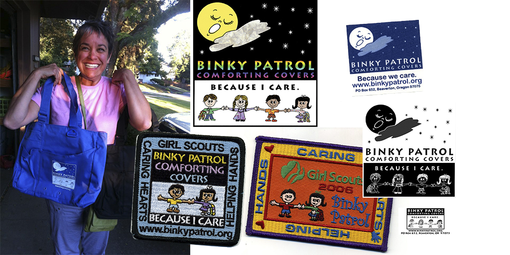
When I doodled the Binky Patrol logo 23 years ago, I didn’t have any thoughts of it still being in use today or all the ways it would be used. I simply doodled something cute with the skills of a 12-year-old. The details would become a problem for embroidery, the eyes would become a problem to reverse out. It was a pencil drawing I photocopied and then colored in, had it scanned and turned into our first banner and brochure. This memory came up while I was speaking with Larry, my client at the Northwest Fencing Center here in Oregon. They are rebranding. Why? Because when their volunteer originally created the logo there wasn’t enough practical thought put into it. In our digitally focused world sometimes we forget that branding is way more inclusive than simply online.
When you are creating a new logo for your company, some things to consider are all the ways and sizes it will be used. How many official variations do you need? If you search for any big brand name and “official logos” you’ll most likely be taken to branding guides and all variations for use of their logos. Learn from them. Real estate franchise firms such as EXIT, C 21 (their new brand name), RE/MAX all have extensive guides of use, spacing around the logo, colors, reversed out versions, what you CANNOT do and more. Again, be inspired.
Some questions to answer before you start creating or before you hire a firm to create your logo:
- Will this go on a billboard?
- Will this go on a Jumbotron in a stadium?
- Will this go on a bus?
- Will this go on a bench?
- Will this wrap a vehicle, van, bus or plane?
- Will this be embroidered on ANYTHING such as hats, shirts, jackets, towels?
- Is there a “mark” variation that will still stand out without the words of our brand? – this is handy for Favicons, promotional giveaways and more.
- Will I need a square, horizontal and vertical version of my logo? The answer is YES, so plan for it.
- Do I need a Black and white version of my logo in BMP form to be on the back of an event shirt? Again, the answer is YES.
- How will it look VERY SMALL, single color or reversed out, or in a weird ink color on a kid’s shirt?
- Does it look too much like other logos out there and can confuse consumers? This happens all the time with those of you who go cheap for the $99 logos online.
- Are you attempting to use unique typefaces such as “got milk?” Coca Cola’s famous “C”, or others? Hint, if you did a search for “Avengers font” or any other brand, chances are you are already on a slippery slope of borrowed interest and copyright issues.
- Will there be sub-branding off the main brand such as Blue Dot Real Estate and Blue Dot REO Services – same BLUE DOT name, but different divisions that all have to tie together?
If you want help with this discovery process BEFORE you hire your designer, let me know. I can also help you create your logo and all the variations you’ll need.


